Who was involved?
This was a task for the Growth Squad/Team within the company.
Project Manager, Data Scientist, CRM/Marketing, SEO Consultant,
4 people Engineering team, UX Designer.
My Role
Sole Product Designer responsible for end to end process. Ideation sessions, research, design development, UI, Journey mapping and delivery.
Tools used
Figma - Wireframing and prototyping
Miro - Ideation workshops
Fullstory - Research and heatmap analytics
Looker - Dashboard for metrics
Photoshop & Illustrator - to sketch the graphics!
Business Outcome
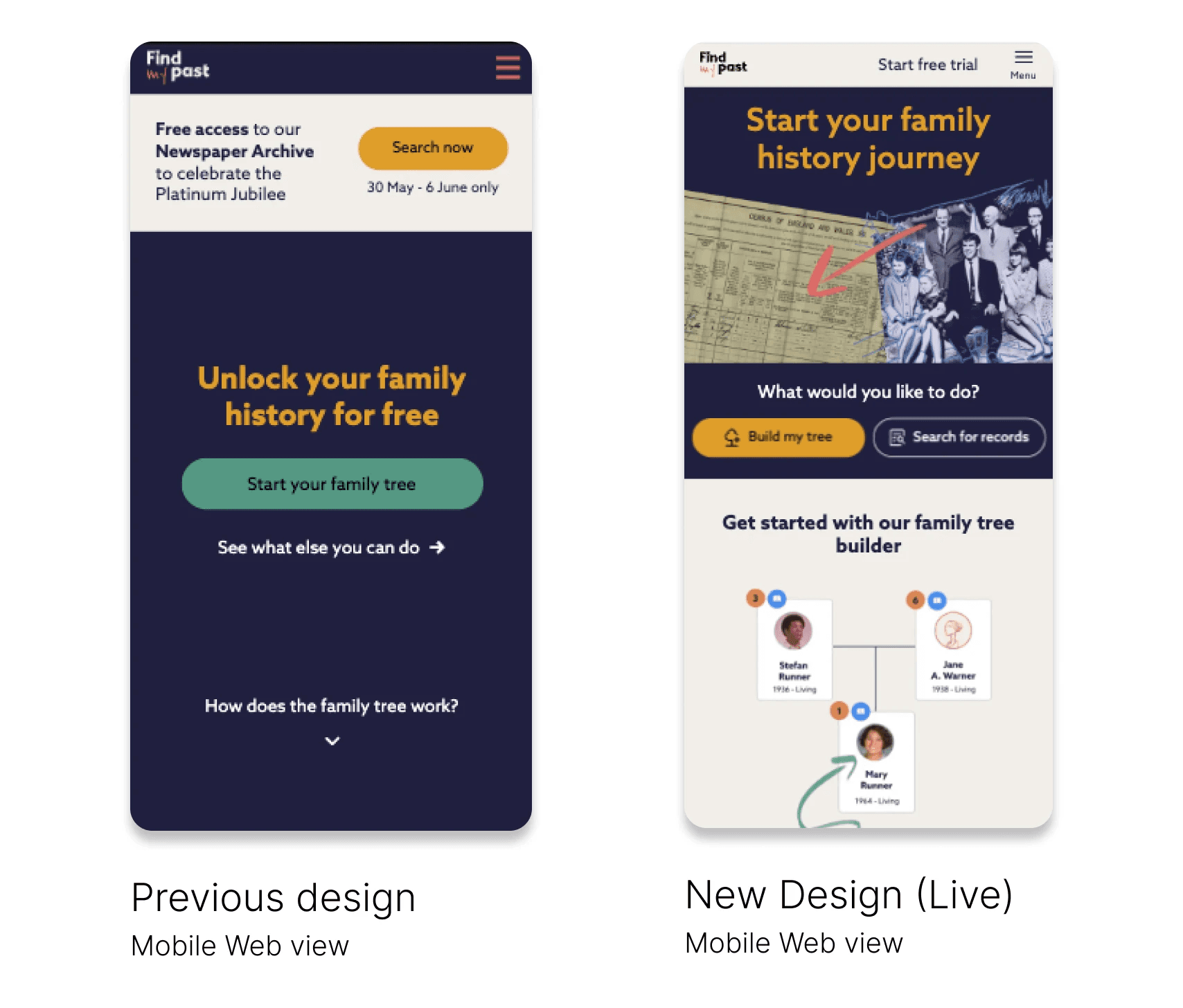
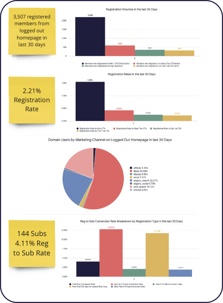
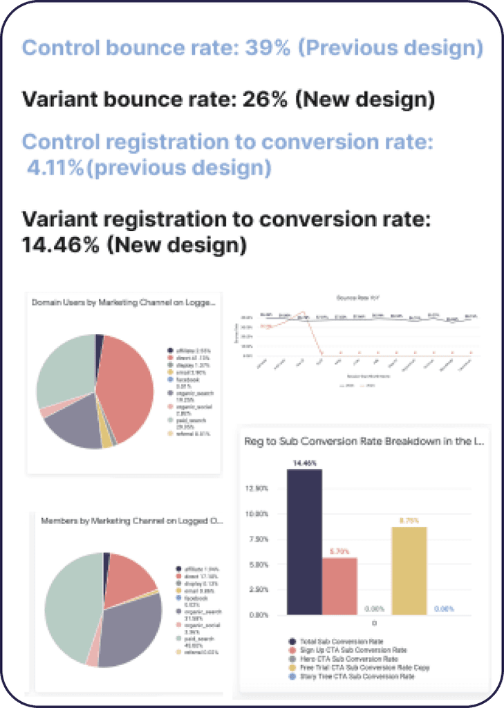
The new design increased the number of users taking a free trial by 11% and improved registration rate by 2X.
User benefits
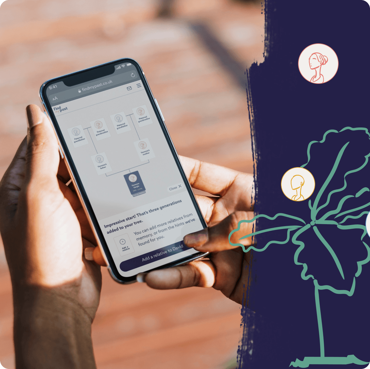
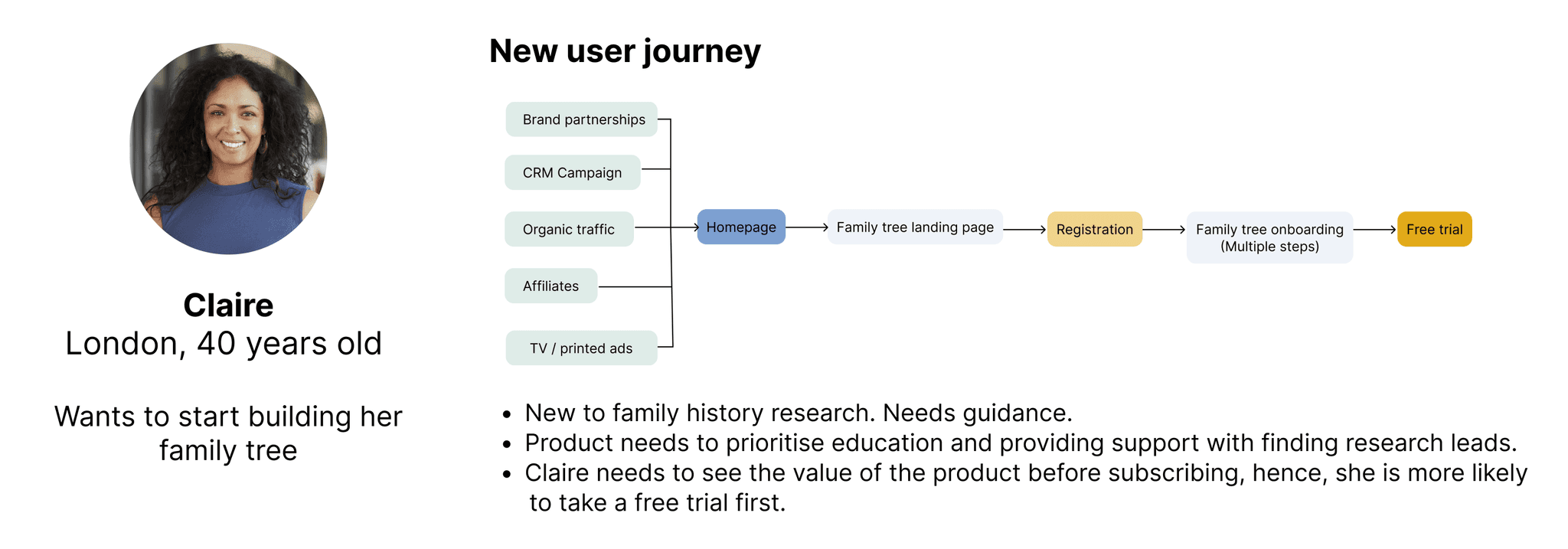
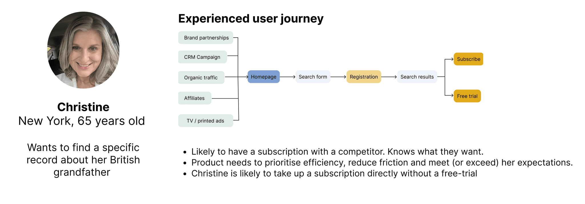
More users had successful onward journeys because they were filtered into the right segment and therefore found what they were looking for quicker without being confused or distracted by other product offerings.
Future iterations
We further optimised this page beyond this project to match various campaigns markeing were running as well as continued iteration and SEO updates depending on what content is being prioritised by the business.
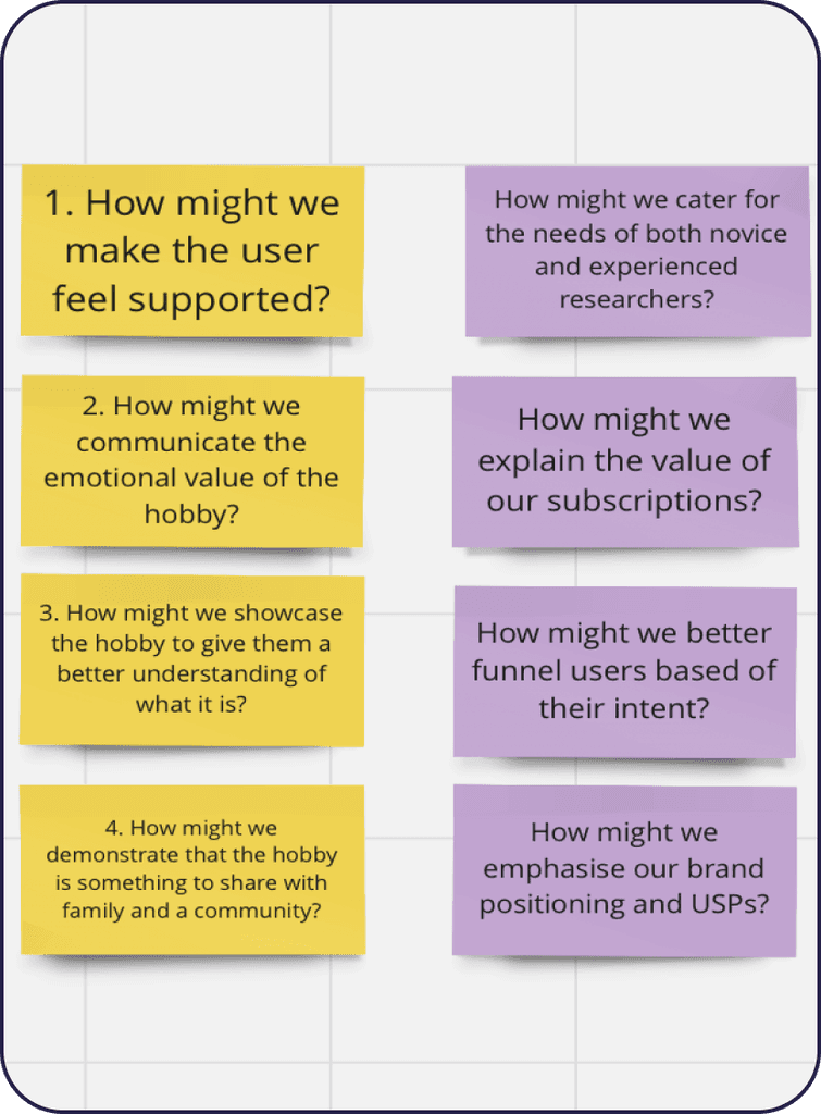


Challenges
De-scoping interactions and animations.
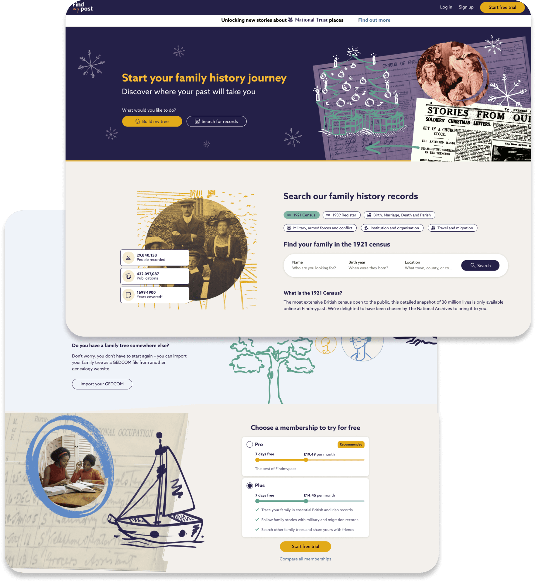
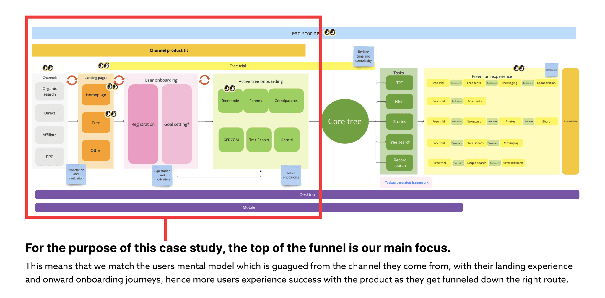
A lot of content needed to be visible for SEO Optimisation therefore creating a very text heavy page.
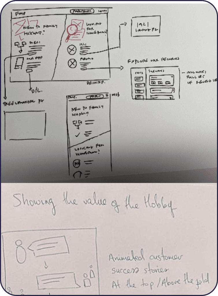
Difficult to have one page to serve two (or more) very different audiences.
Stakeholder management due to many interested parties as this is the page with the largest amount of traffic at our company. Therefore any drop in performance is risky.
Outcomes
Increase in number of free trials taken by 2X.
4X improvement in the free-trial to subscription conversion.
Fewer family trees created due to more users going straight to search, however the trees created were more detailed.
Bounce rate reduced by 11%
Future iterations
Including some more interactions and animations to increase delight and intrigue.
Optimising the value proposition by experimenting with content hierarchy.
Reducing the number of CTA on the page to funnel users down one registration route.