Optimizing the Family Tree Builder Onboarding Experience for Mobile

Optimizing the Family Tree Builder Onboarding Experience for Mobile

The goal of this project was to enhance the onboarding experience for new users of the family tree builder on mobile devices where 60% of new user traffic comes from.

By creating a custom mobile onboarding flow, we aimed to increase completion rates and enable users to experience the value of the product quicker.

Brief

Brief

Brief

Re-design the onboarding journey for the family tree builder product, focussed on getting new users to add 8 people to their family tree because that is the point at which they experience better "hints" and have more valuable exchanges with the product.


Goal: Optimising the flow for engagement, delight and better registration to free trial rate

The main product landing page had not been refreshed in 4 years and was design to guide users to “Build their family tree” which is the primary action we want new users to take.

Re-design the onboarding journey for the family tree builder product, focussed on getting new users to add 8 people to their family tree because that is the point at which they experience better "hints" and have more valuable exchanges with the product.


Goal: Optimising the flow for engagement, delight and better registration to free-trial rate

Who was involved?

This was a task for the Growth Squad/Team within the company.


Project Manager, Data Scientist, CRM/Marketing, SEO Consultant,

4 people Engineering team, UX Designer.

My Role

Sole Product Designer responsible for end to end process. Ideation sessions, research, design development, UI, Journey mapping and delivery.

Tools used

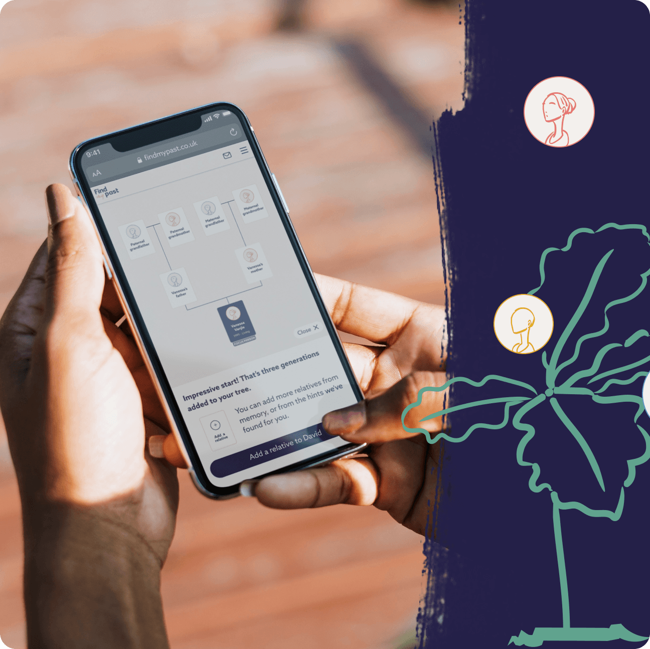
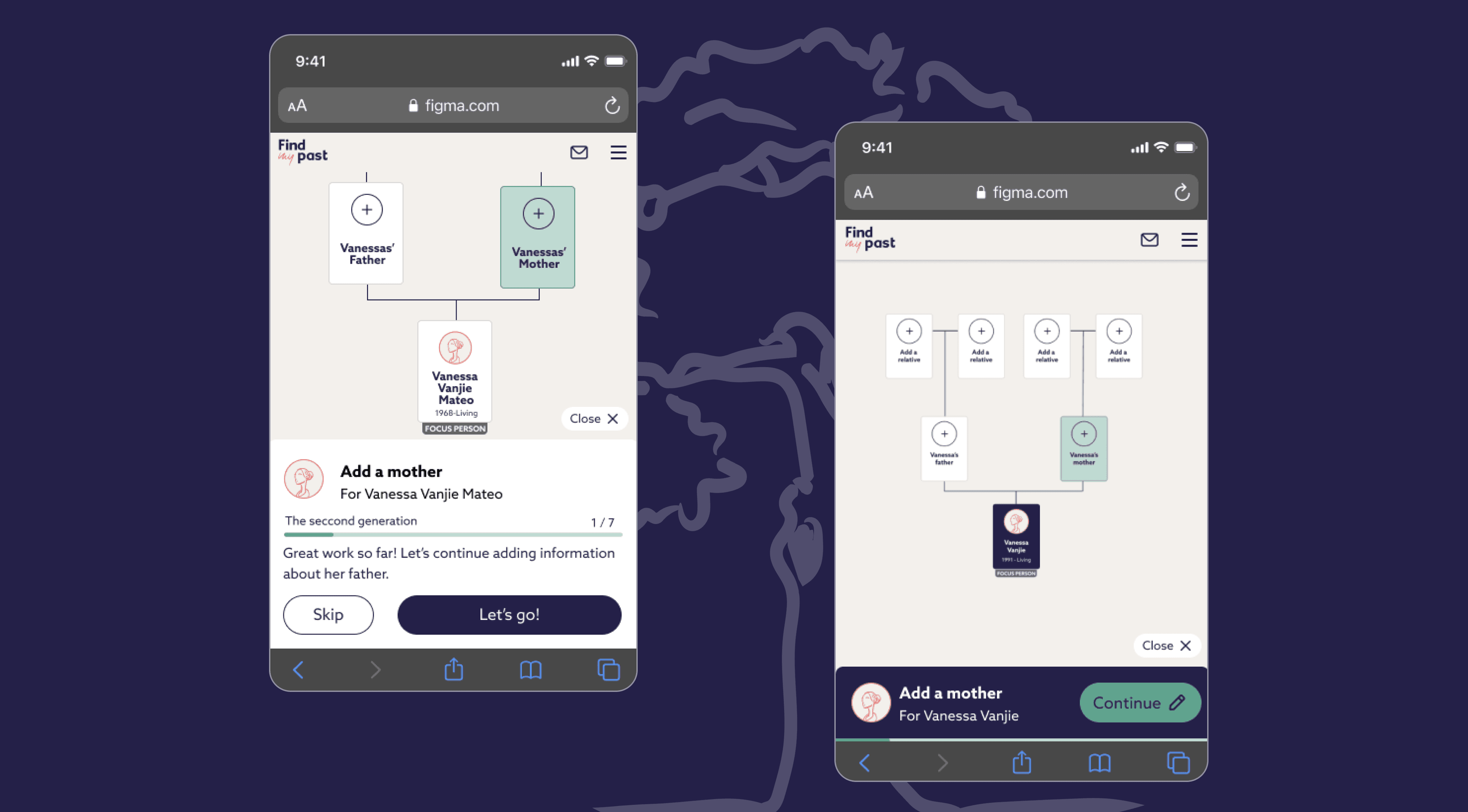
Figma - Wireframing and prototyping

Miro - Ideation workshops

Fullstory - Research and heatmap analytics

Looker - Dashboard for metrics

Photoshop & Illustrator - to sketch the graphics!

Results

Results

Overview

Business Outcome

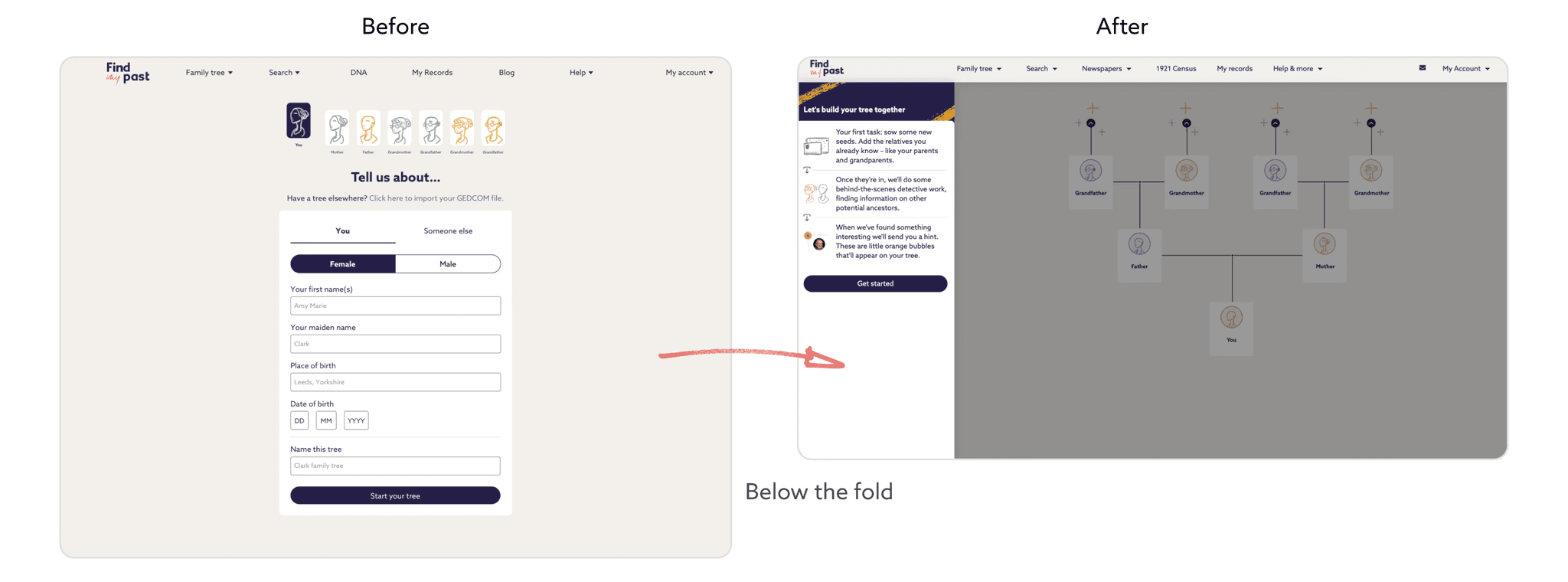
Lower drop off rate - From 42% to 34%


Increase in number of users creating trees with 8 nodes.

User benefits

More users had successful onward journeys because they were filtered into the right segment and therefore found what they were looking for quicker without being confused or distracted by other product offerings.

Future iterations

Start to introduce the concept of hints and records to the user within onboarding and provide some genealogy advice or tutorials while they build their tree.

Project process

Project process

Key learnings from the successfully re-designed

desktop journey:

Key learnings from the successfully re-designed desktop journey:

Key learnings from the successfully re-designed desktop journey:

Key learnings from the succesfully re-designed desktop journey:

  1. Show the user their family tree in context of filling out the form helped users to understand the product post-onboarding.


  2. Even if users abandoned onboarding, they found it easier to build their trees with the new design, as onboarding took place on tree canvas.


  3. Having a welcome message helped users understand what hints were and how the product works better.


  4. New design helped the users see their progress and feel like they were in the process of building a tree, as opposed to a manual data entry task.

  1. Showing the user their family tree in context of filling out the form helped users to understand the product post-onboarding


  1. Even if users abandoned onboarding, they found it easier to build their trees with the new design, as onboarding took place on tree canvas.


  1. Having a welcome message helped users understand what hints were and how the product works better.


  1. New design helped the users see their progress and feel like they were in the process of building a tree, as opposed to a manual data entry task.

  • Observation: The onboarding design improved user success but led to a 20% decrease in information input.


  • Impact: Reduced inputs led to reduced the generation of system generated "hints," which are crucial for guiding users and providing early value.


  • Retention Concern: Fewer users were experiencing the delight of finding matches, leading to higher churn within the first 14 days.


  • Data entry is boring: Mobile users had to fill out a series of 8 forms and it was a overwhelming and tedious task leading to frustration.

Main pain points and concerns with the

previous mobile onboarding

Main pain points and concerns with the previous mobile onboarding

Main pain points and concerns with the

previous mobile onboarding

  • Observation: The onboarding design improved user success but led to a 20% decrease in information input.


  • Impact: Reduced inputs led to reduced the generation of system generated "hints," which are crucial for guiding users and providing early value.


  • Retention Concern: Fewer users were experiencing the delight of finding matches, leading to higher churn within the first 14 days.


  • Data entry is boring: Mobile users had to fill out a series of 8 forms and it was a overwhelming and tedious task leading to frustration.

Scoping and Discovery

Scoping and Discovery

Delving into the data to understand the live solution and its performance as well as the success rate across different devices.

Delving into the data to understand the live solution and its performance as well as the success rateacross different devices.

We had an ideation session with the team after analysing the data and comparing the old designs with the new ones.

We had an ideation session with the team after analysing the data and comparing the old designs with the new ones.

This session helped us identify ways in which we can create a mobile friendly onboarding for new users to experience delight within their first session.

This session helped us identify ways in which we can create a mobile friendly onboarding for new users to experience delight within their first session.

Onboarding user flows - Before and After

Onboarding user flows - Before and After

UX & UI Decision making
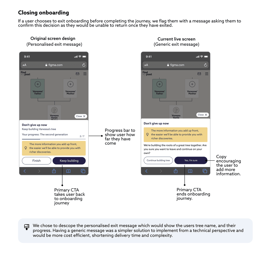
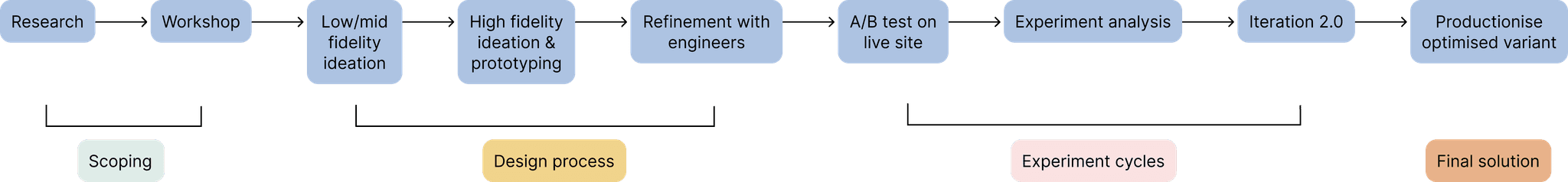
Key Learnings

Key Learnings

Challenges

Tech limitations
Due to complexities around loading the family tree in the background we compromised from a design perspective by rendering a “demo” tree that was not interactive as per the initial vision.


Project velocity
To prove out certain hypothesis and decisions made with low tech effort we ran lots of small iterative experiments on the onboarding to figure out the optimal flow instead of a whole re-design.
This was a challenge because the design had many aspects de-scoped in first iterations which were gradually built upon.

Outcomes

Experimentation with the location of paywalls helped us to learn that showing a user a paywall twice led to better conversion.


We also saw more users complete more input fields by 60%


Users who completed the onboarding were also more likely to engage with the tree canvas better after exiting onboarding.

Future iterations

Trying to introduce the concept of hints within onboarding.


Provide personalised experiences for various cohorts based on their record matches.


Include some intent capture in onboarding to better tailor the product experience for users.

Do you want to try out the live onboarding journey?

Check it out on the link below

p.s. I also designed the landing page it links to :)

Create a free website with Framer, the website builder loved by startups, designers and agencies.